Passionate about typography, colour, shapes and print in all its forms. Looking for surprising, unique and eye catching results by disassembling and reassembling shapes through the process, and using them as a formative language in my work.
A selection of work done between 2015 - 2024
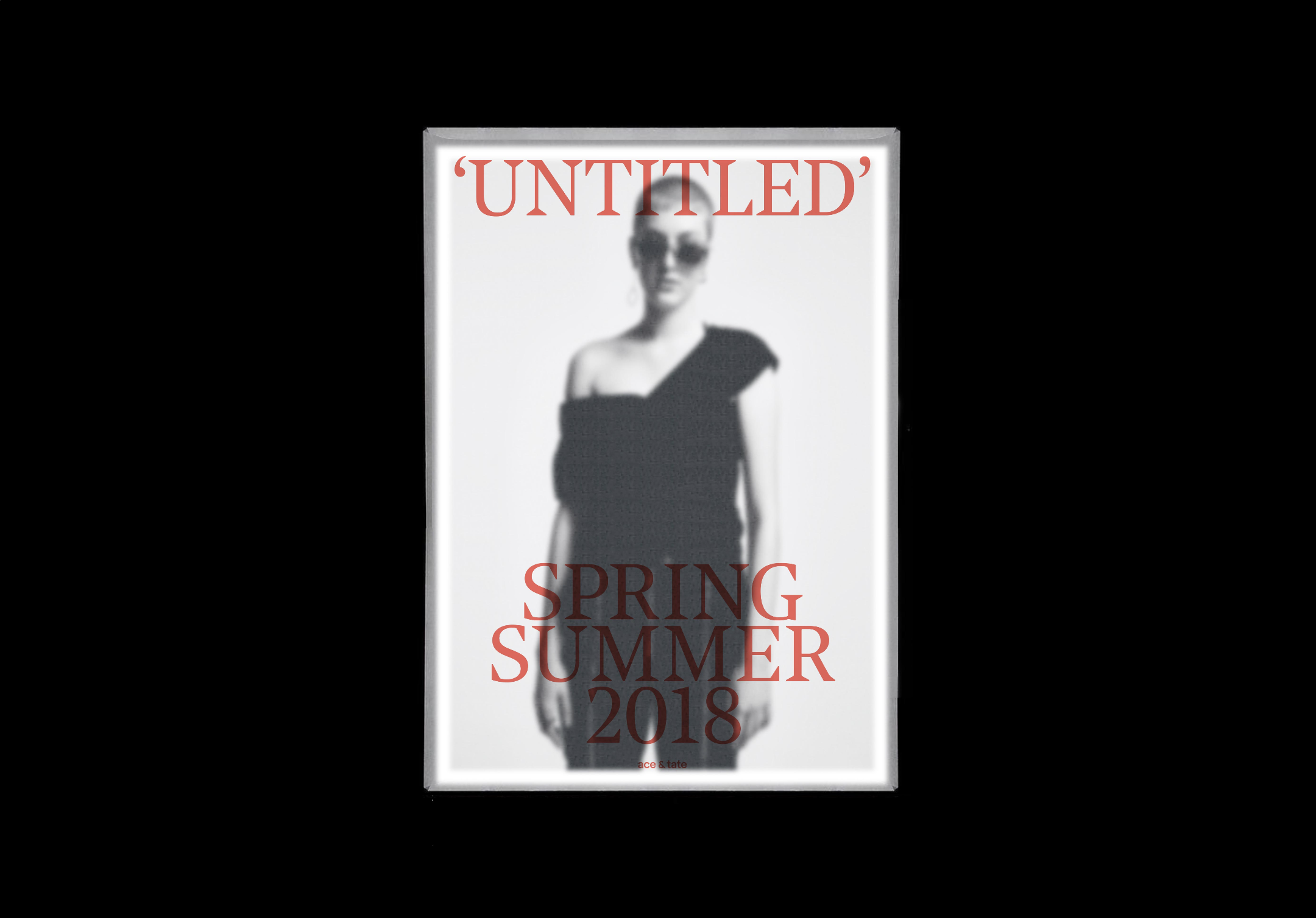
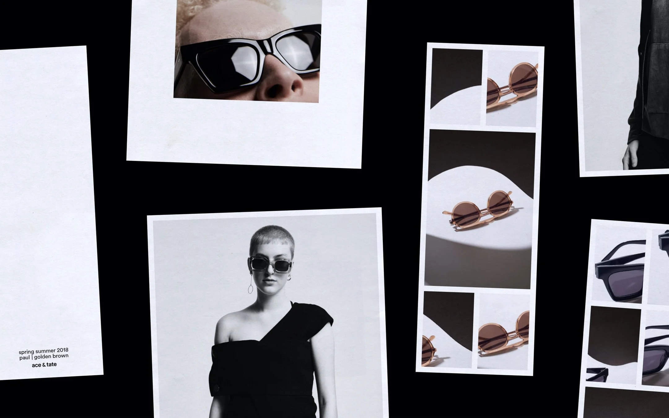
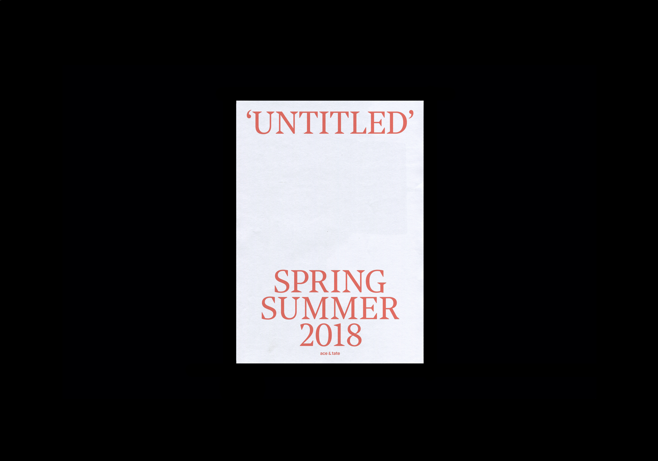
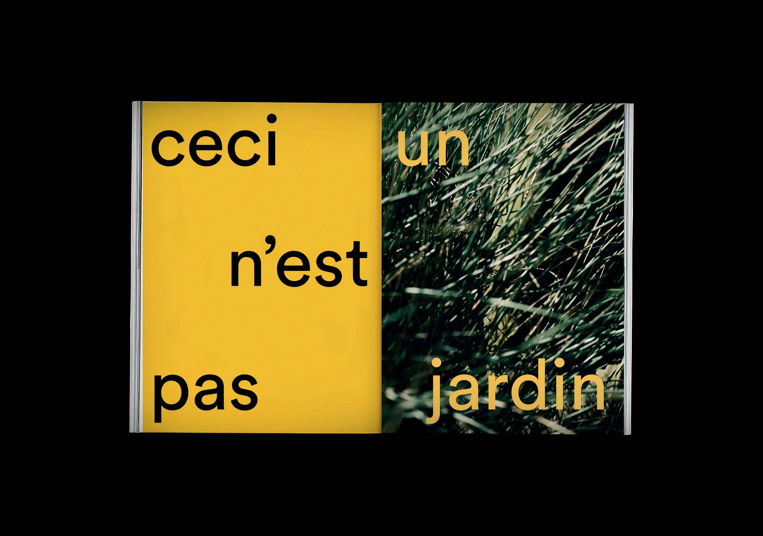
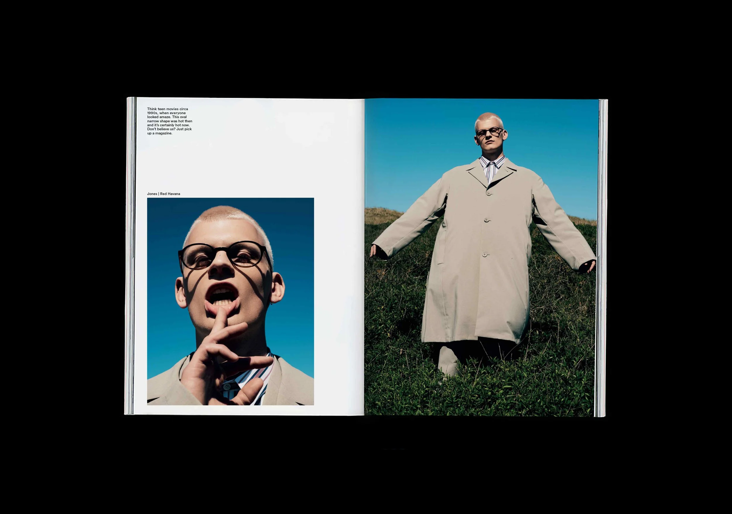
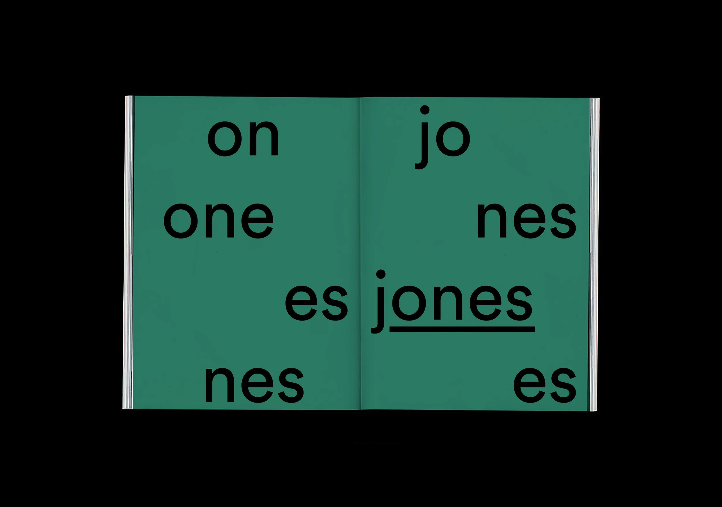
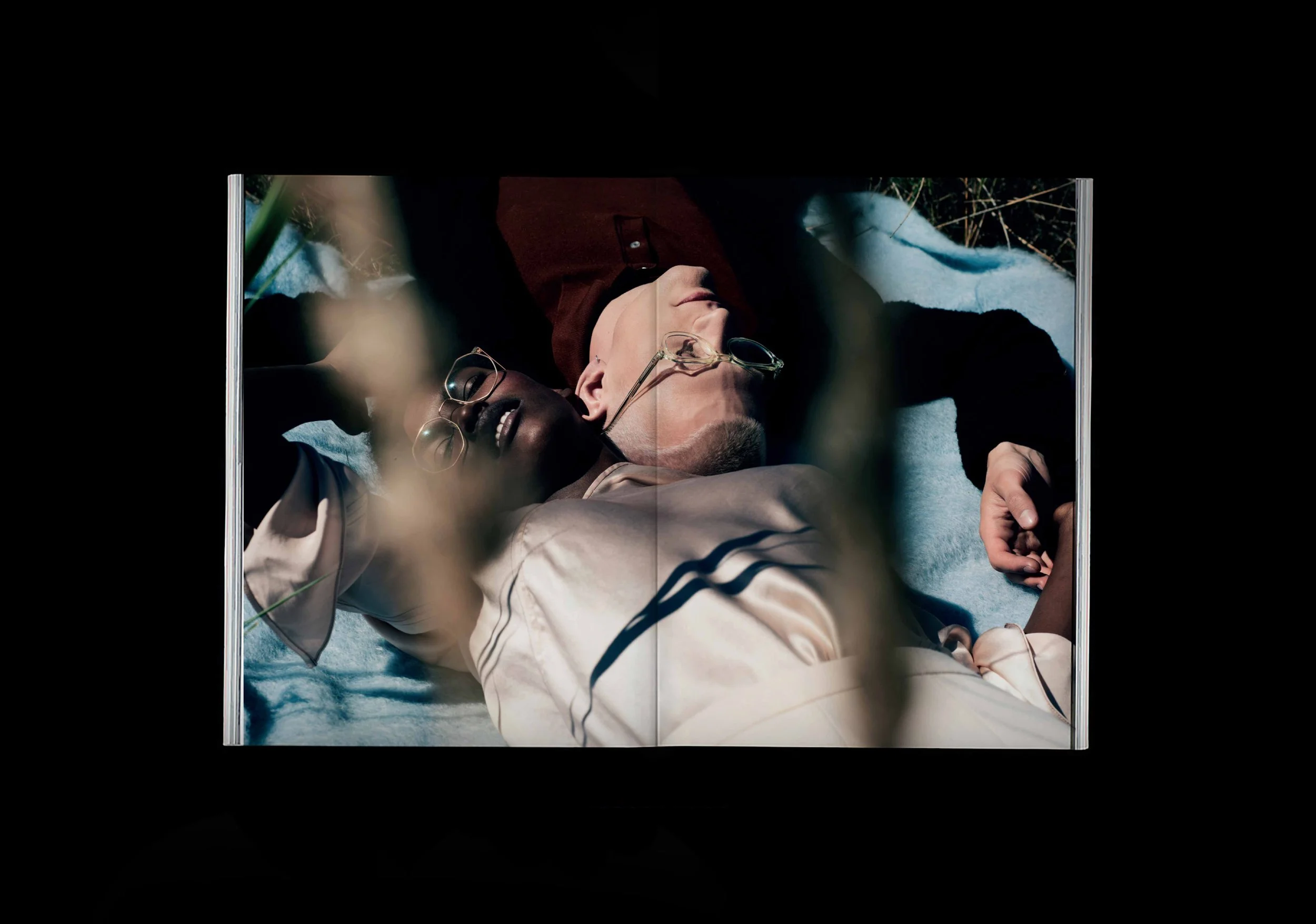
Ace & Tate Spring/Summer lookbook 2018 'Untitled'.
The lookbook consists lose pages in two different sizes.
UNTITLED
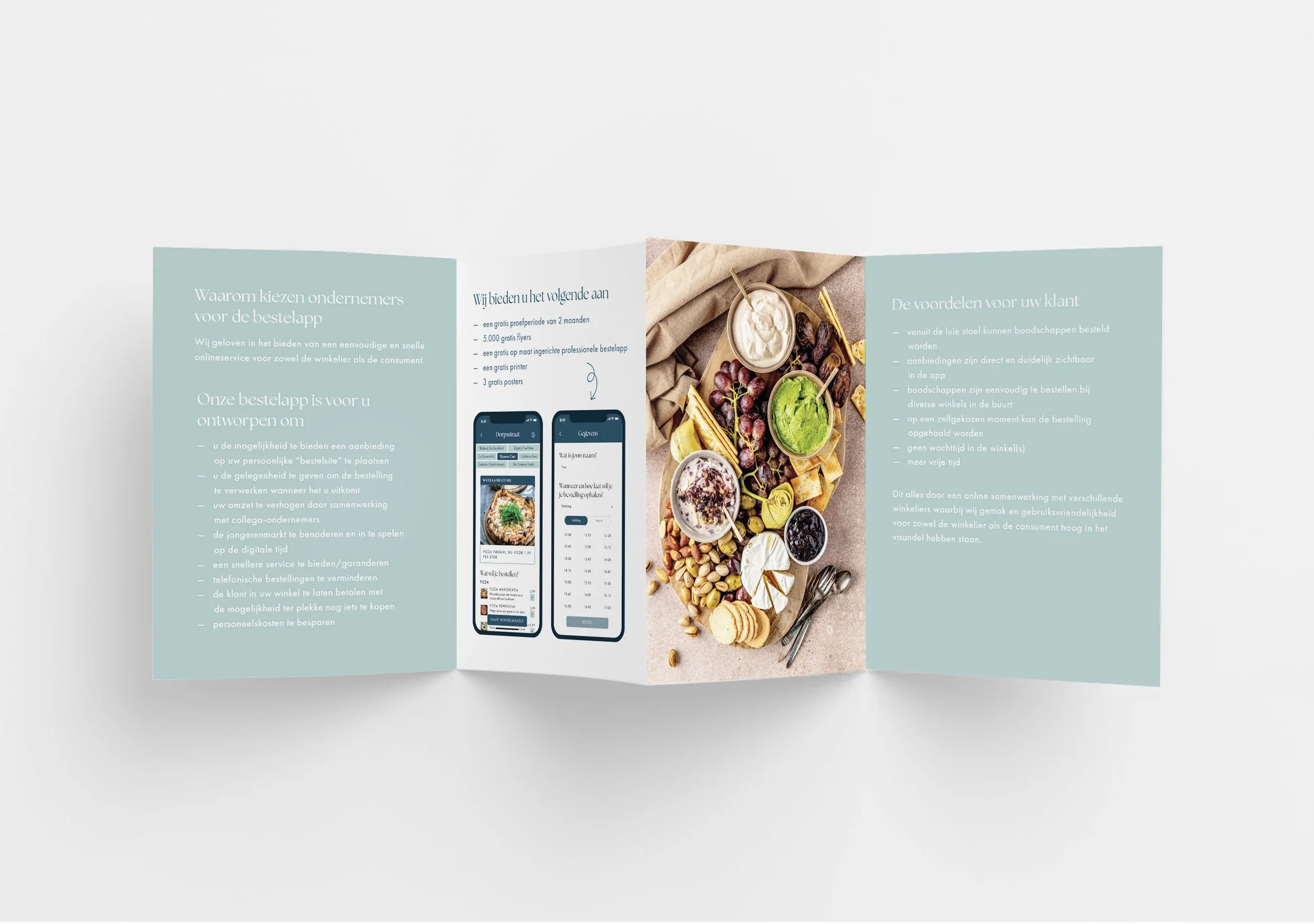
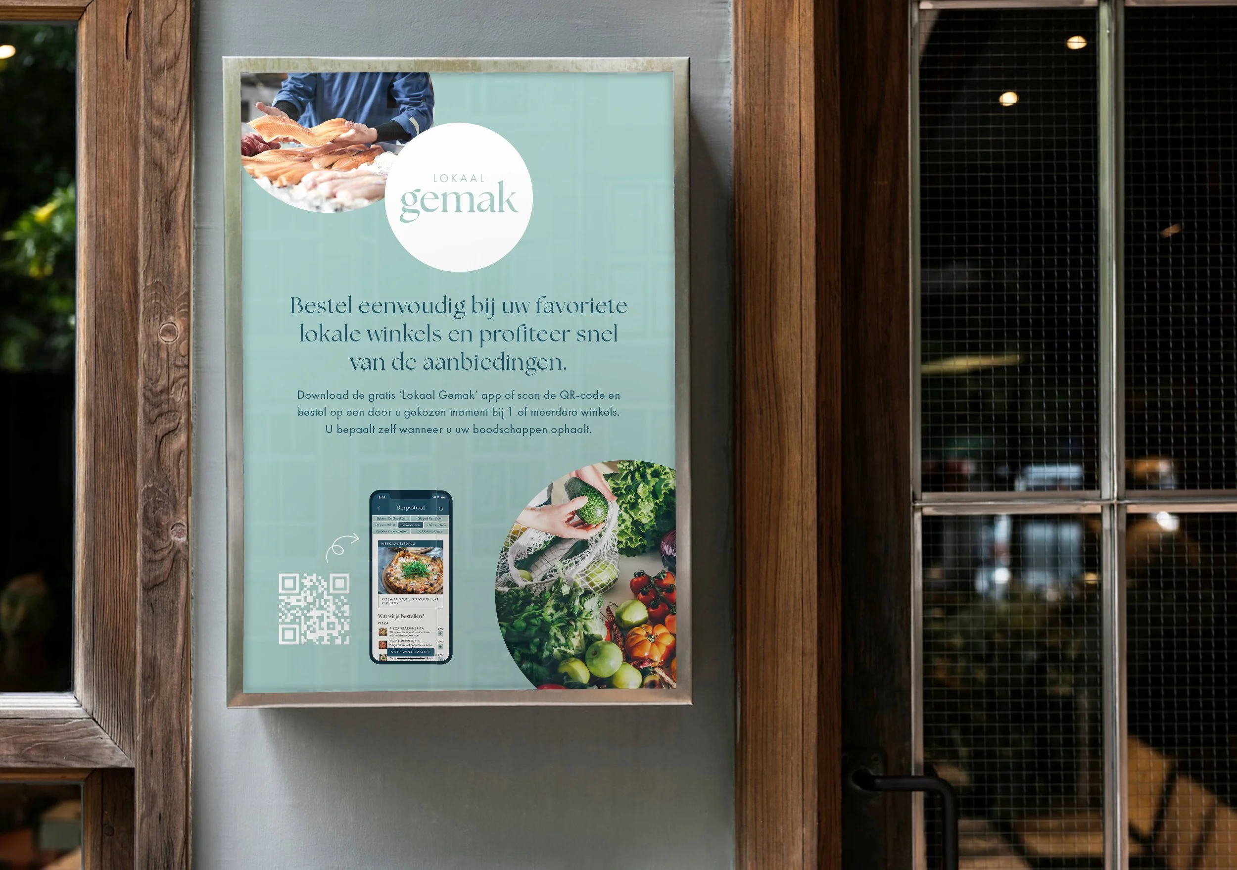
The visual identity of Lokaak Gemak
LOKAAL GEMAK
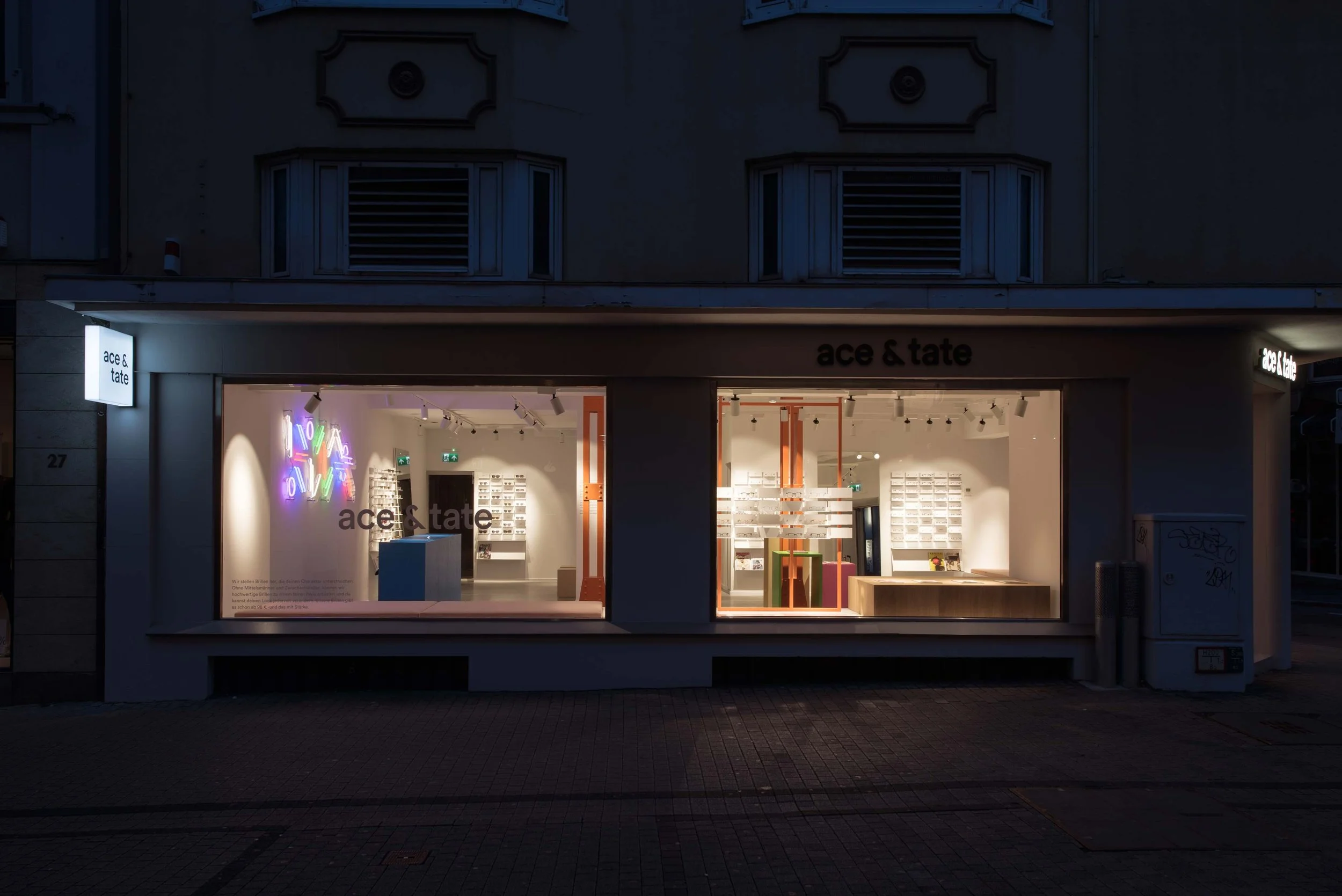
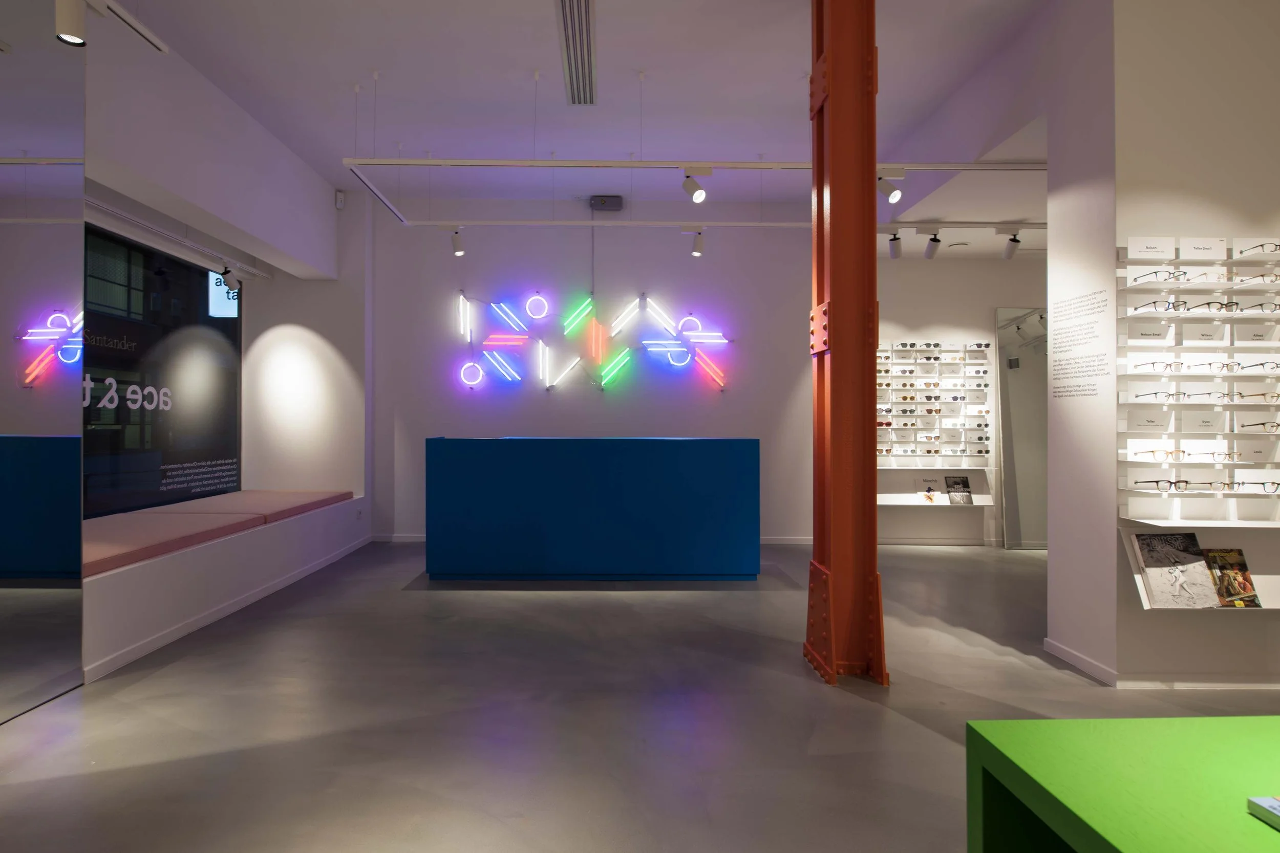
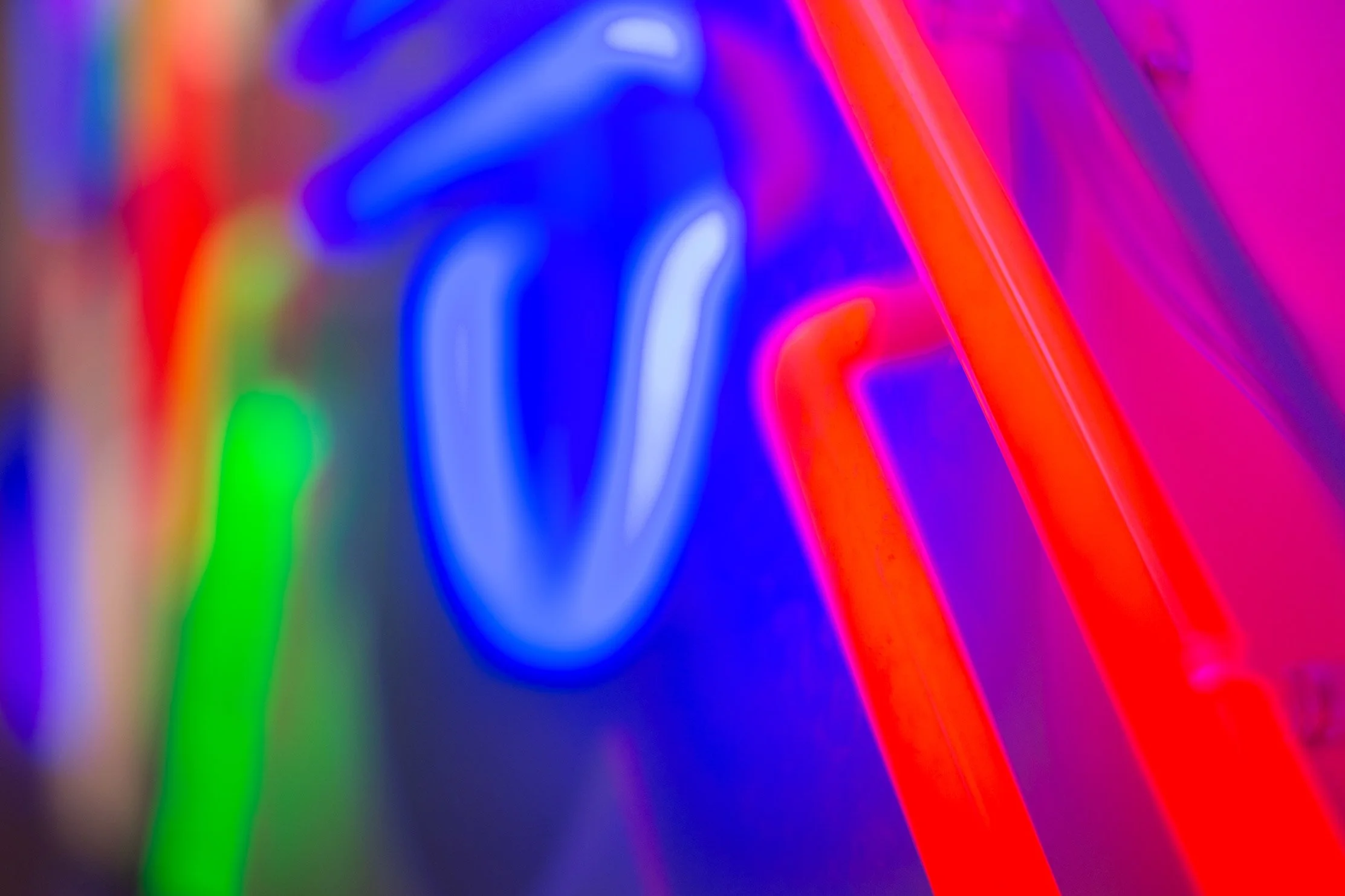
Neon design created for the Ace & Tate store in Stuttgart, inspired by the architecture of the Neue Staatsgalerie art museum in Stuttgart.
NEON
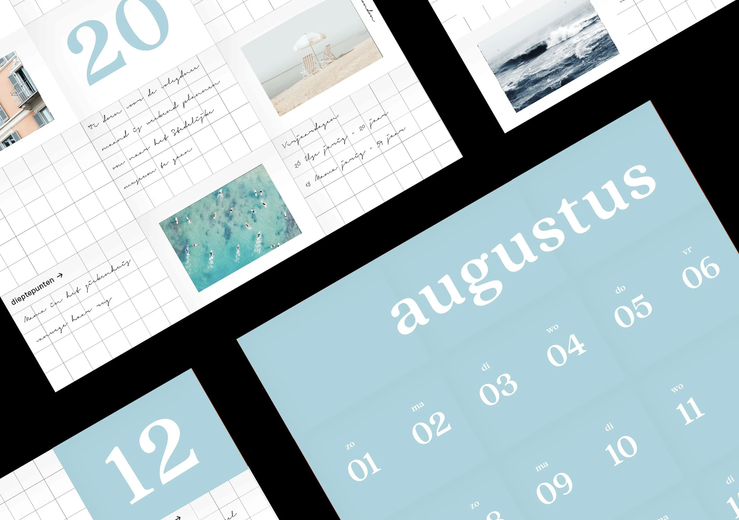
A multifunctional calendar that you can keep as a reminder with photos, notes and events of the respective month.
CALENDAR
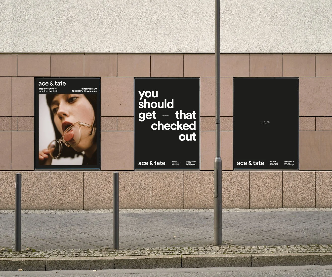
Triptych of posters to promote the Ace & Tate store in The Hague.
CAN'T READ THIS?
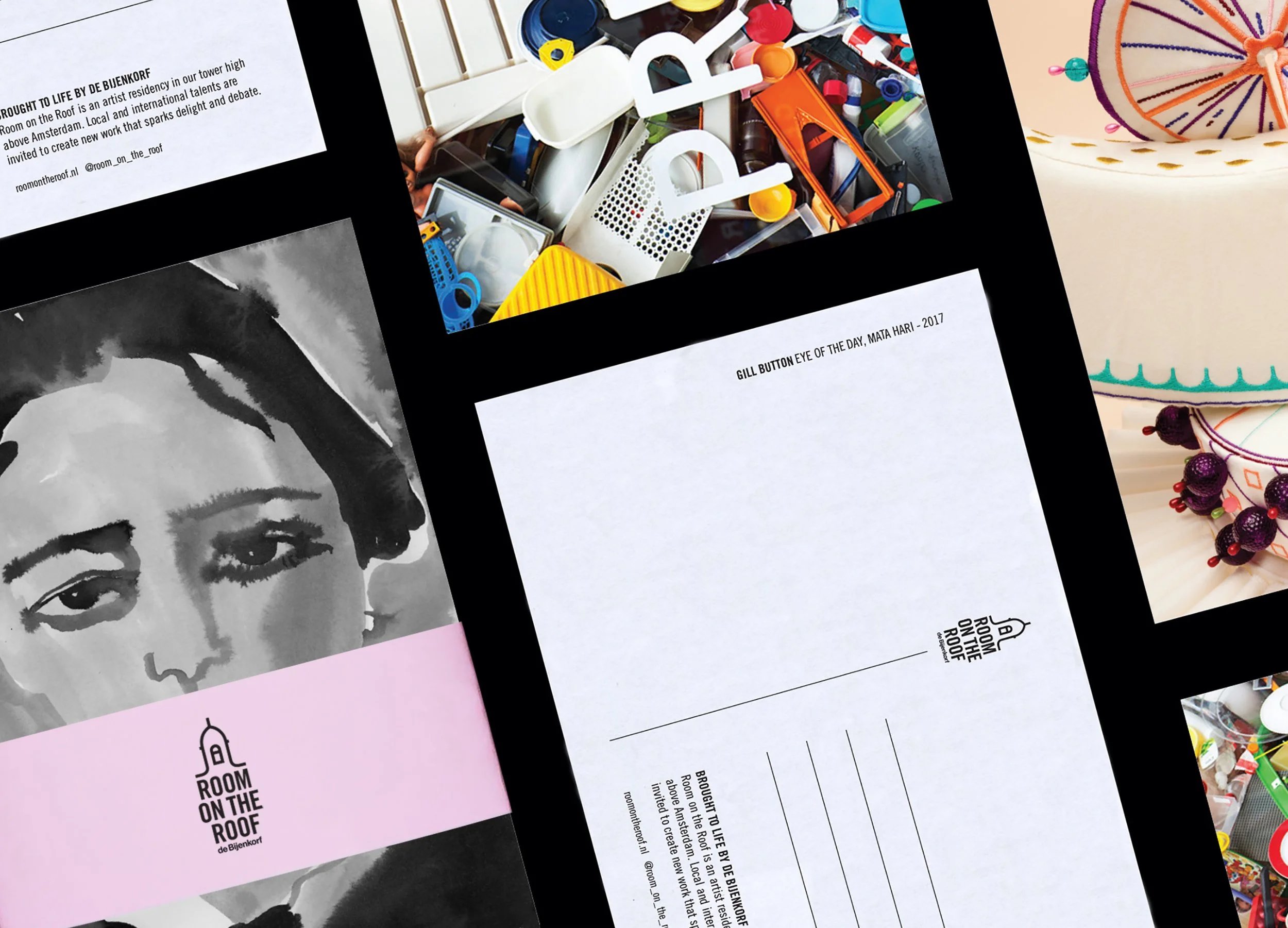
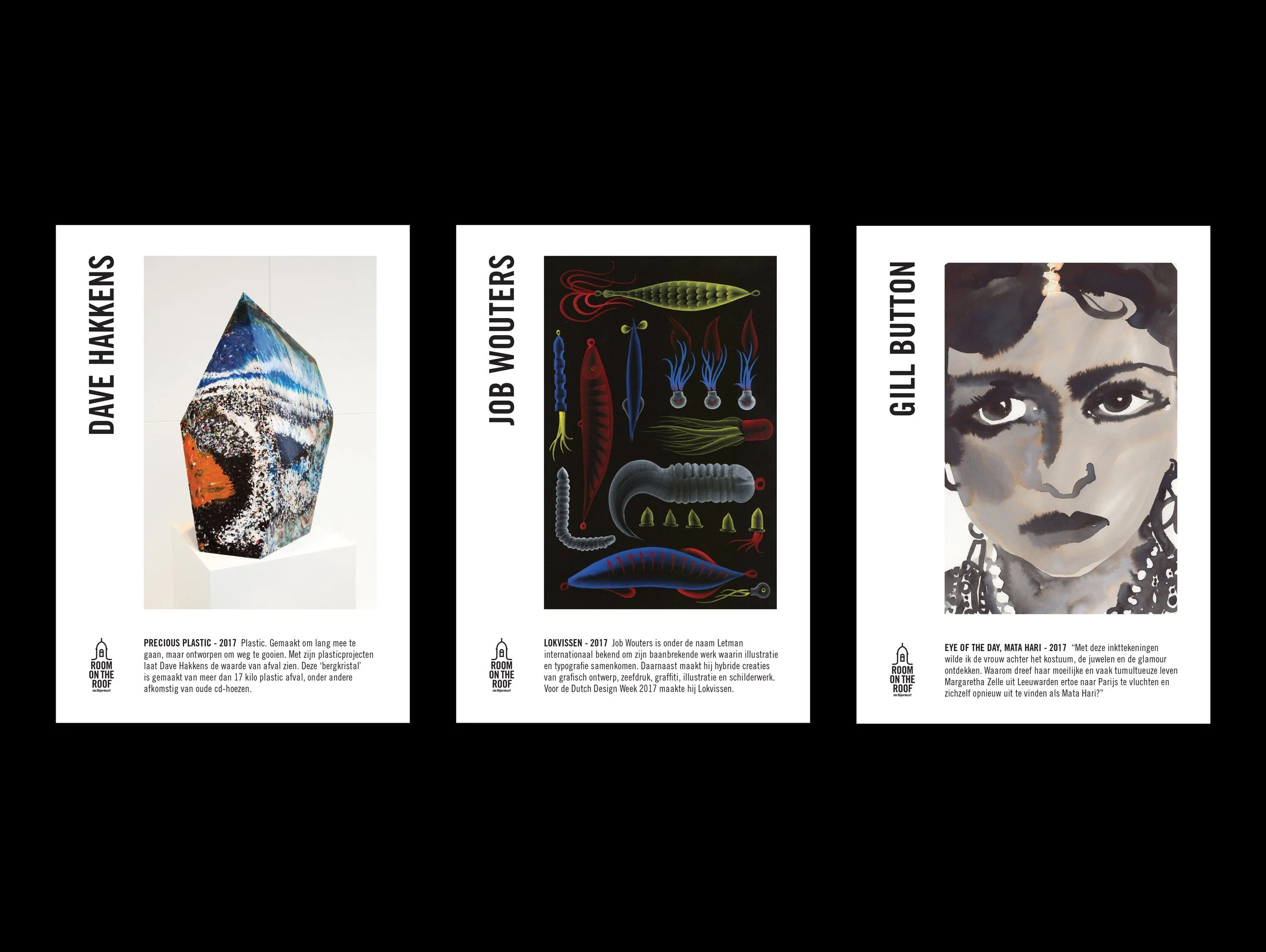
Designed to introduce a new audience to Room on the Roof as we wanted to tell/inform about the collaborations with local and international artists, writers, musicians, architects and designers.
ROOM ON THE ROOF
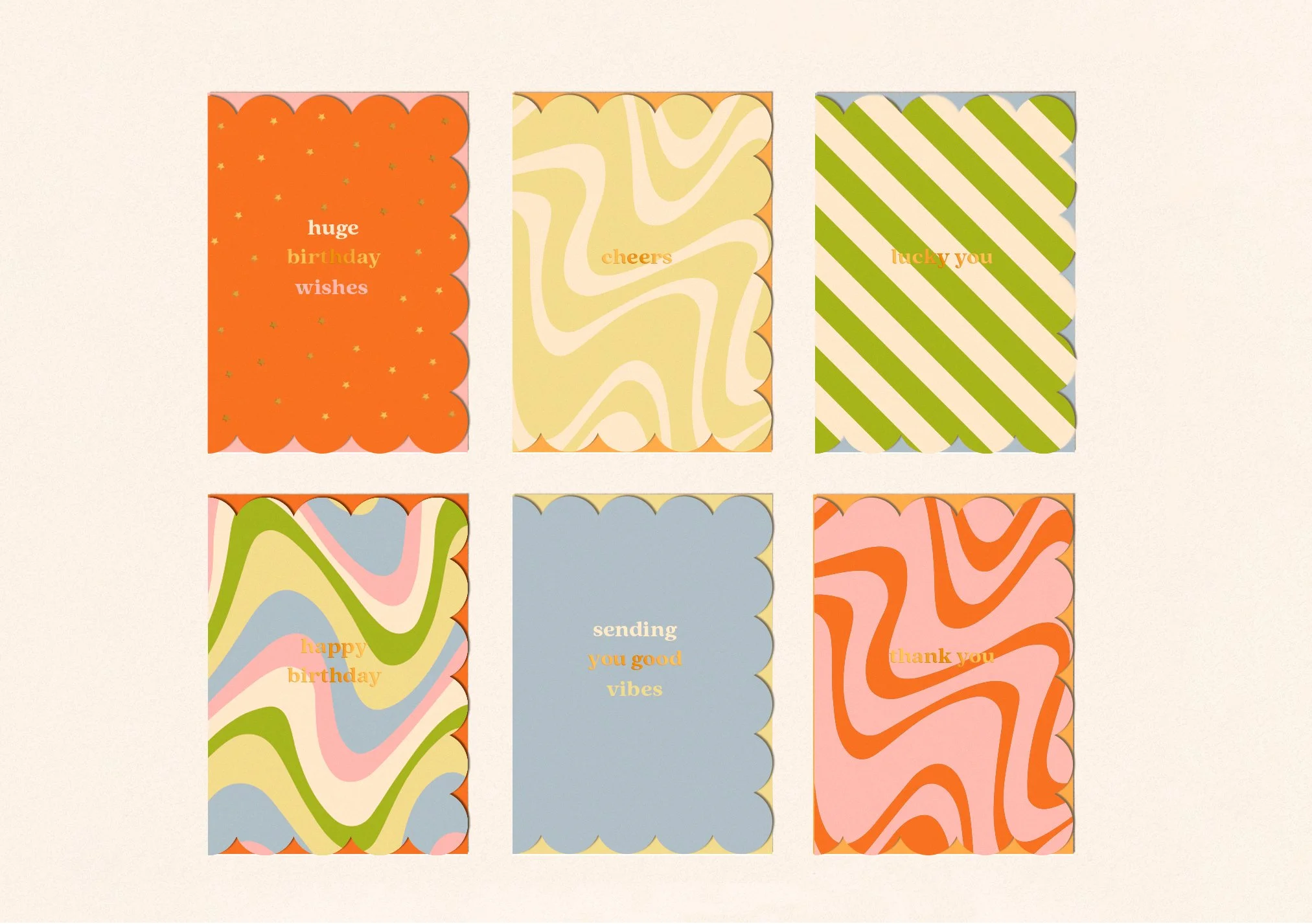
CARDS
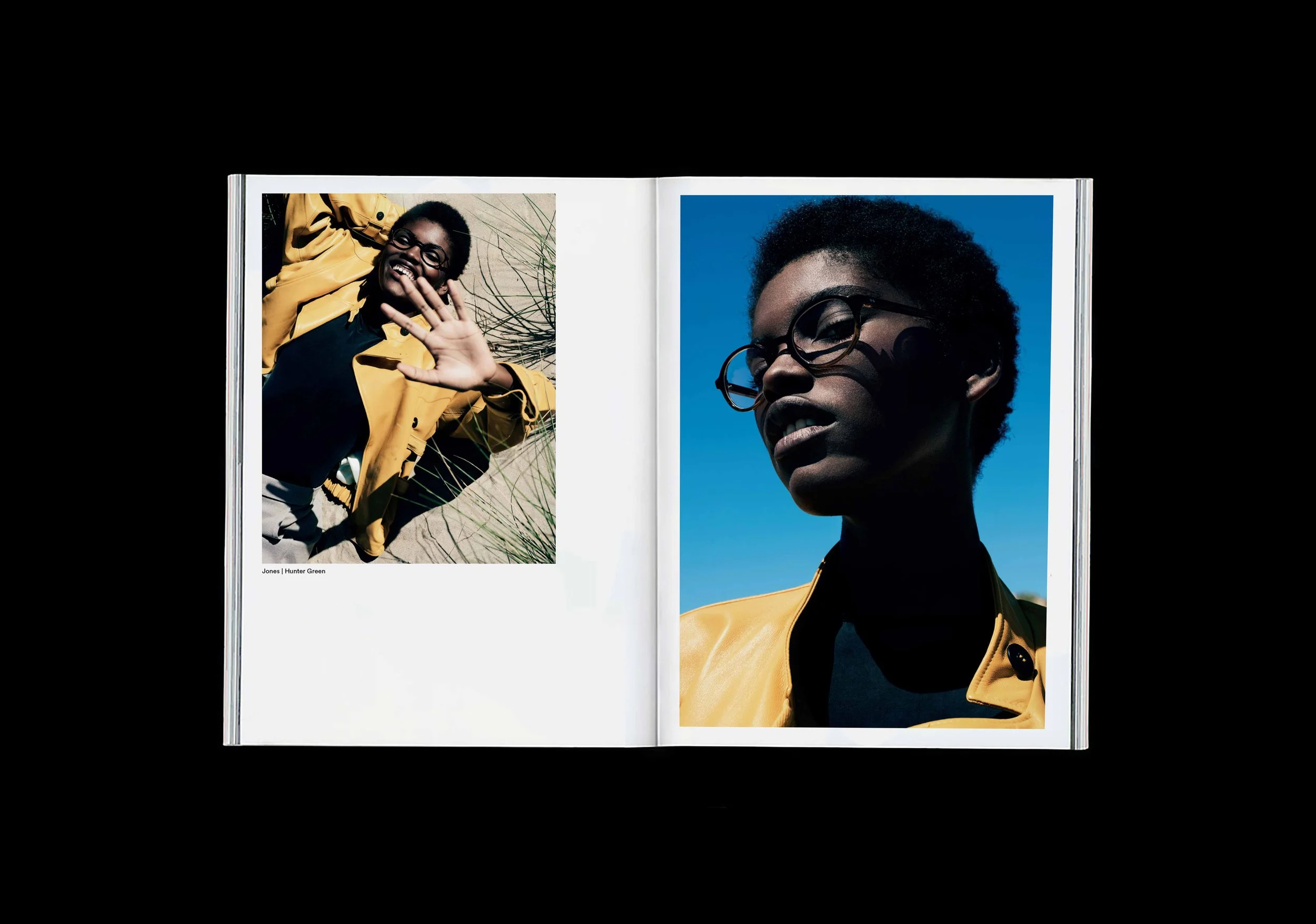
Ace & Tate Autumn/Winter lookbook 2017 'Field Notes'.
FIELD NOTES
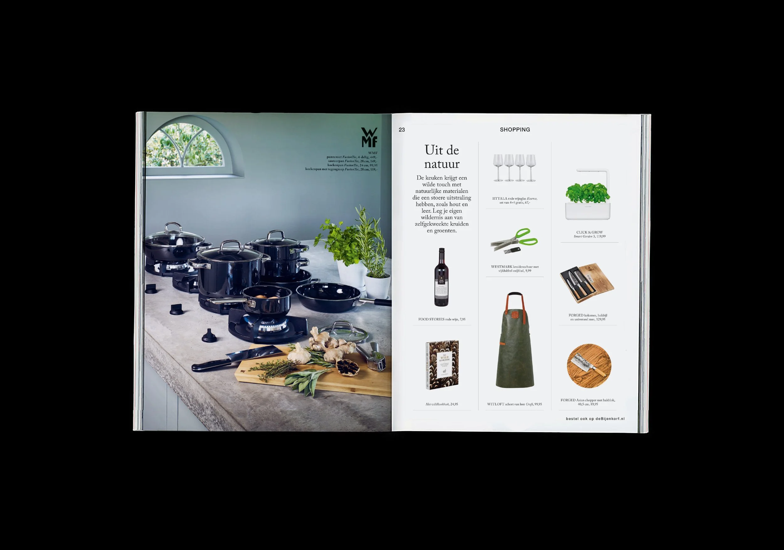
De Bijenkorf autumn magazine 2018
MAGAZINE
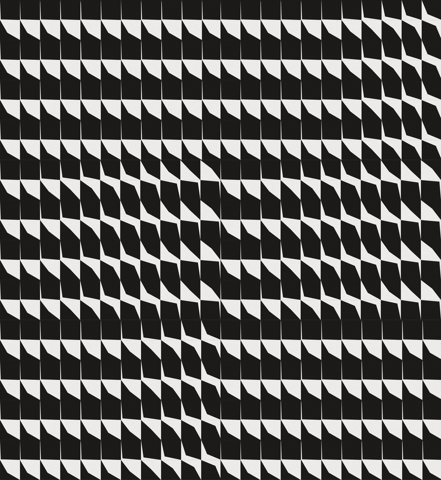
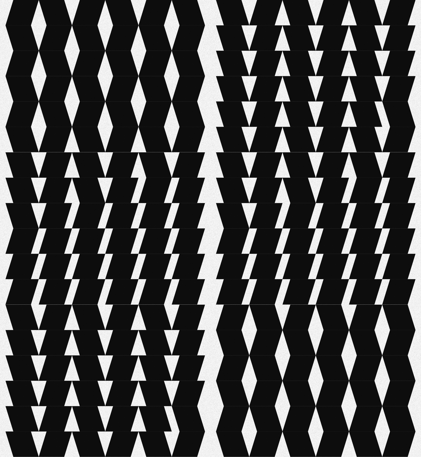
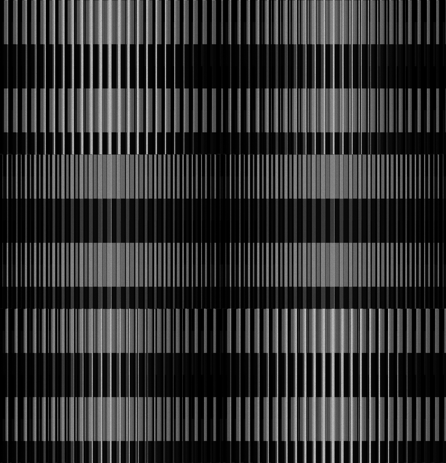
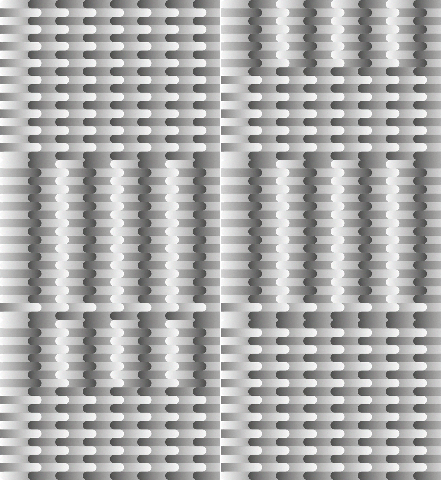
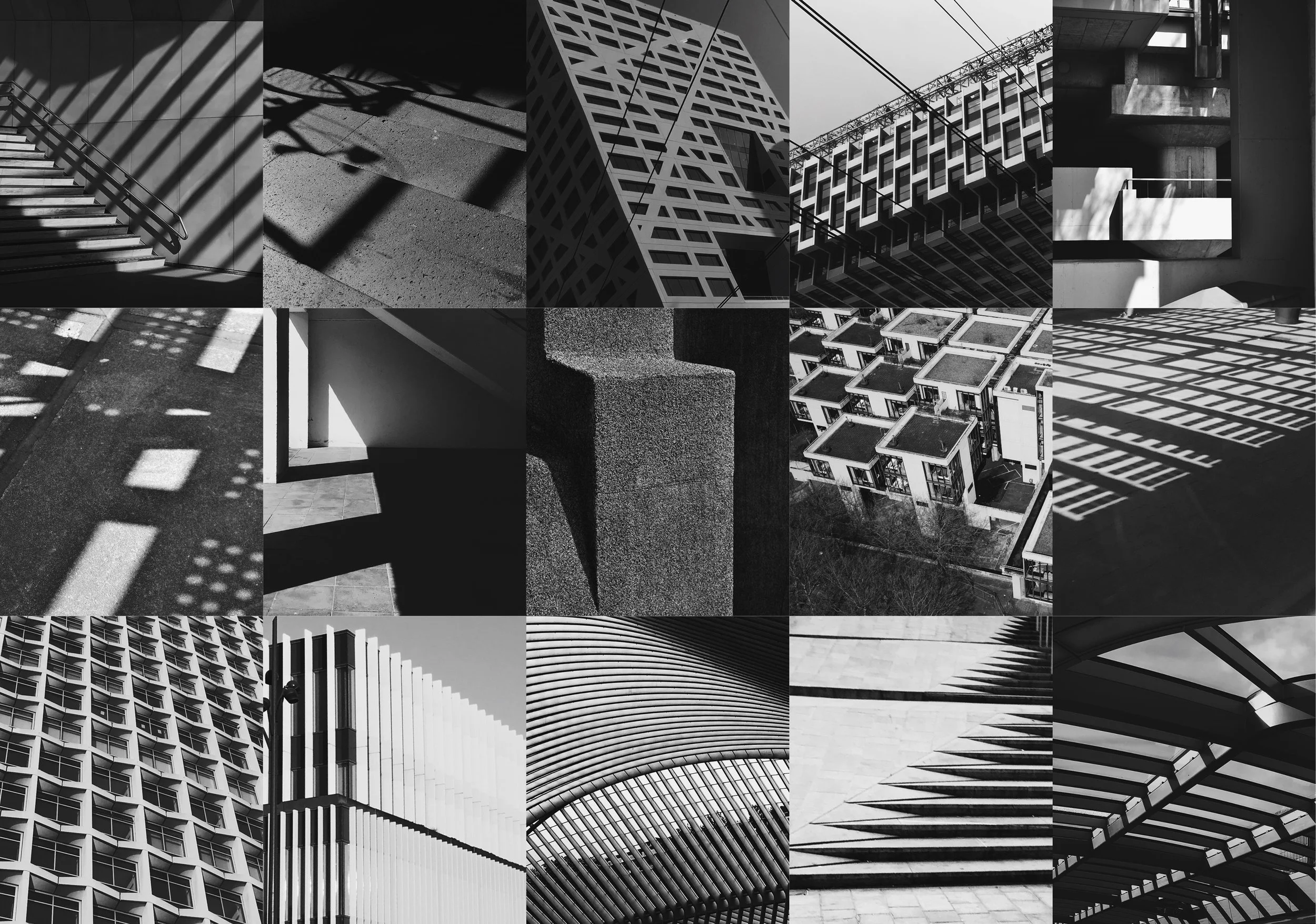
The patterns are inspired of pictures I’ve taken of architecture. I capture lines, incidence of light, repetition of forms and structure and create my own patterns.
MOVING ARCHITECTURE
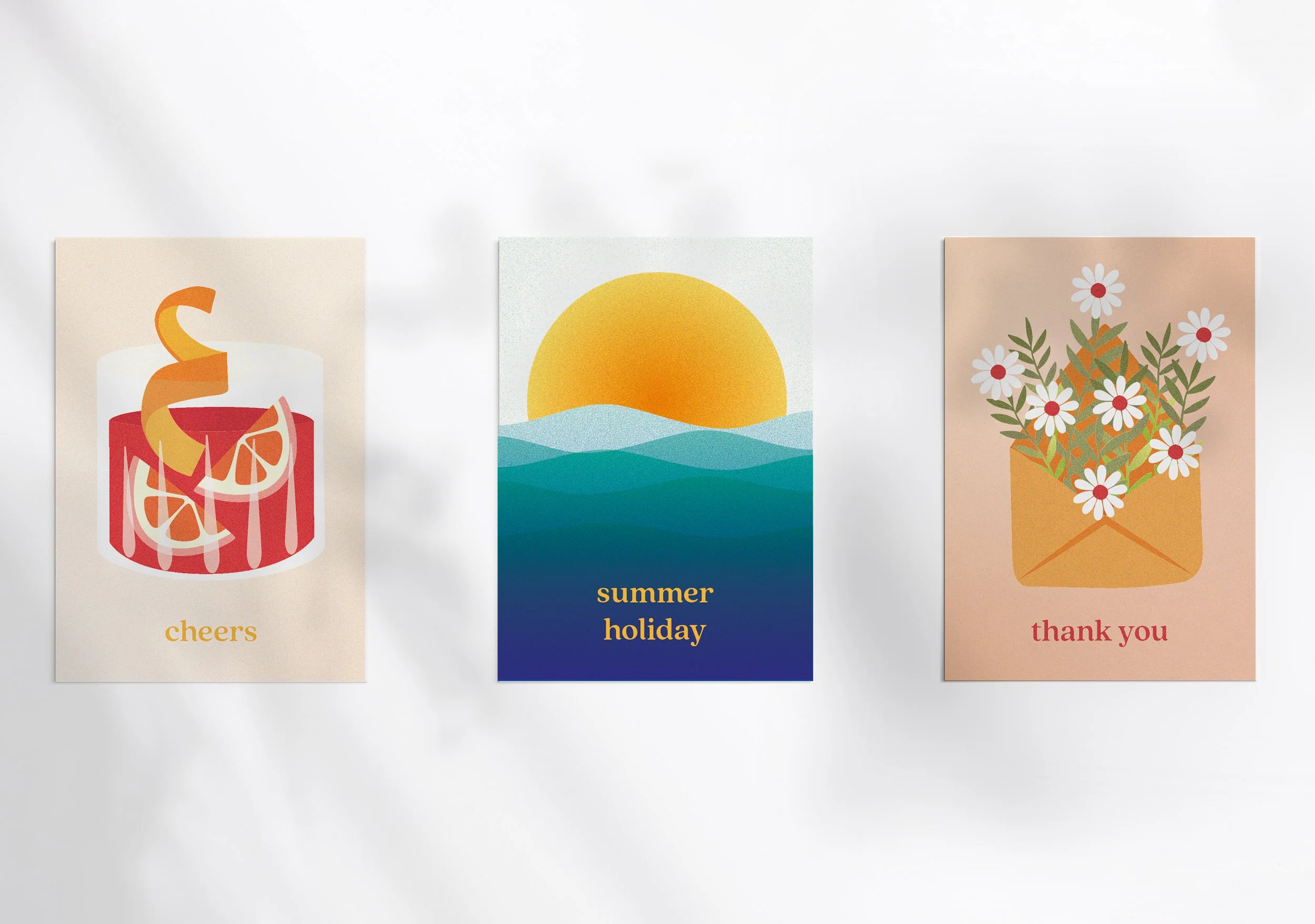
CARDS
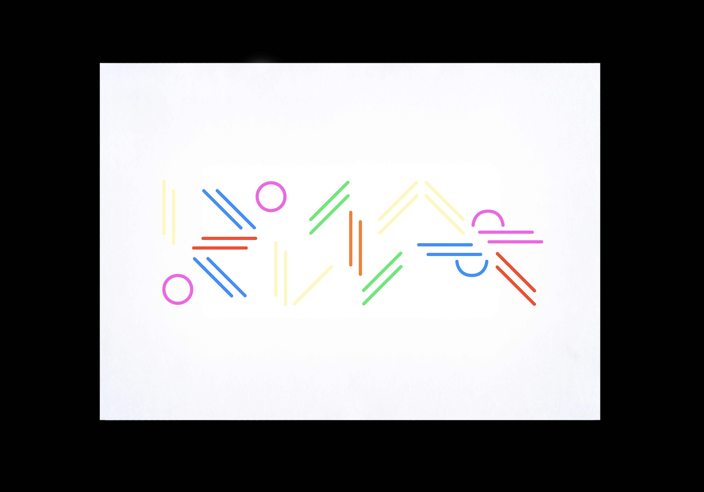
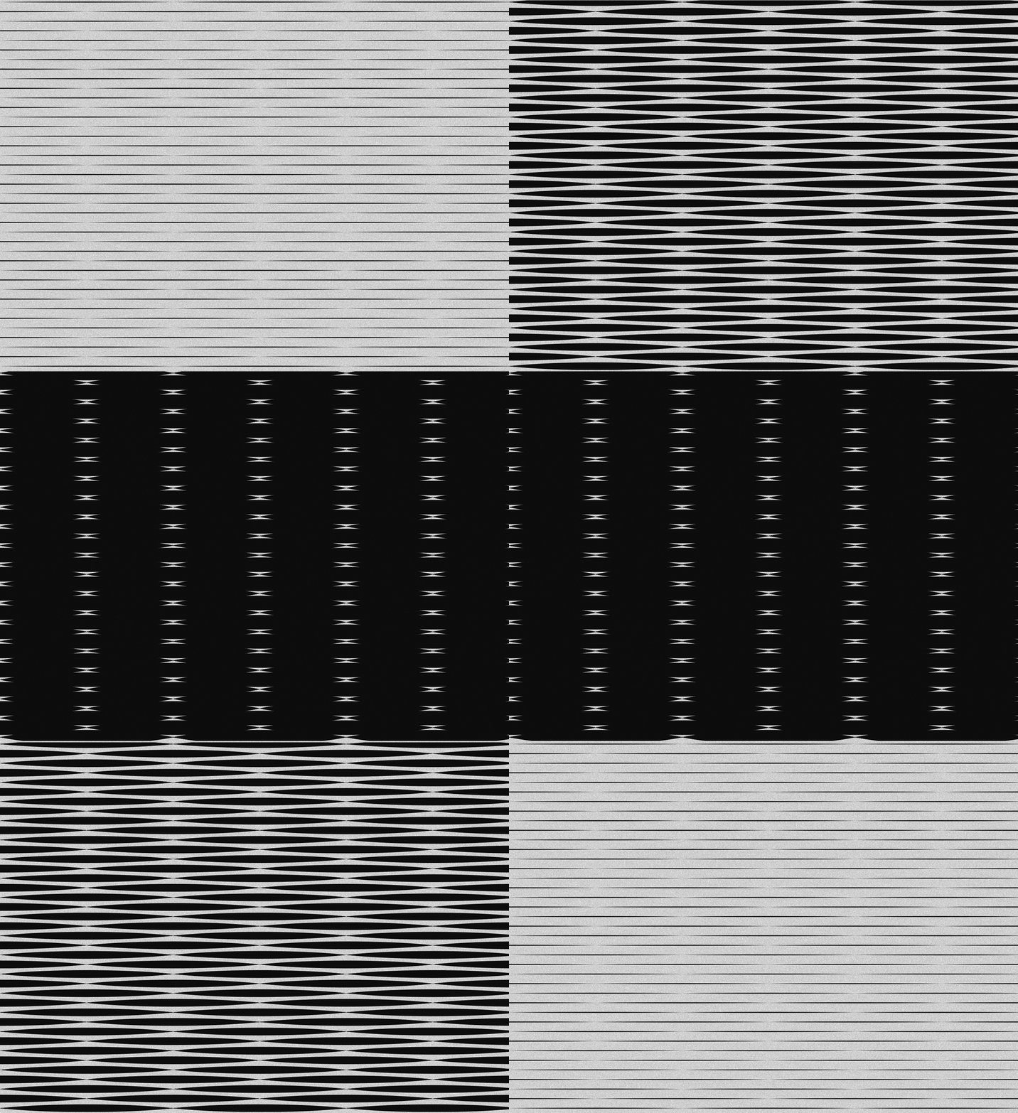
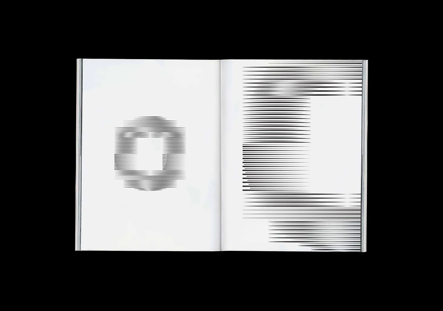
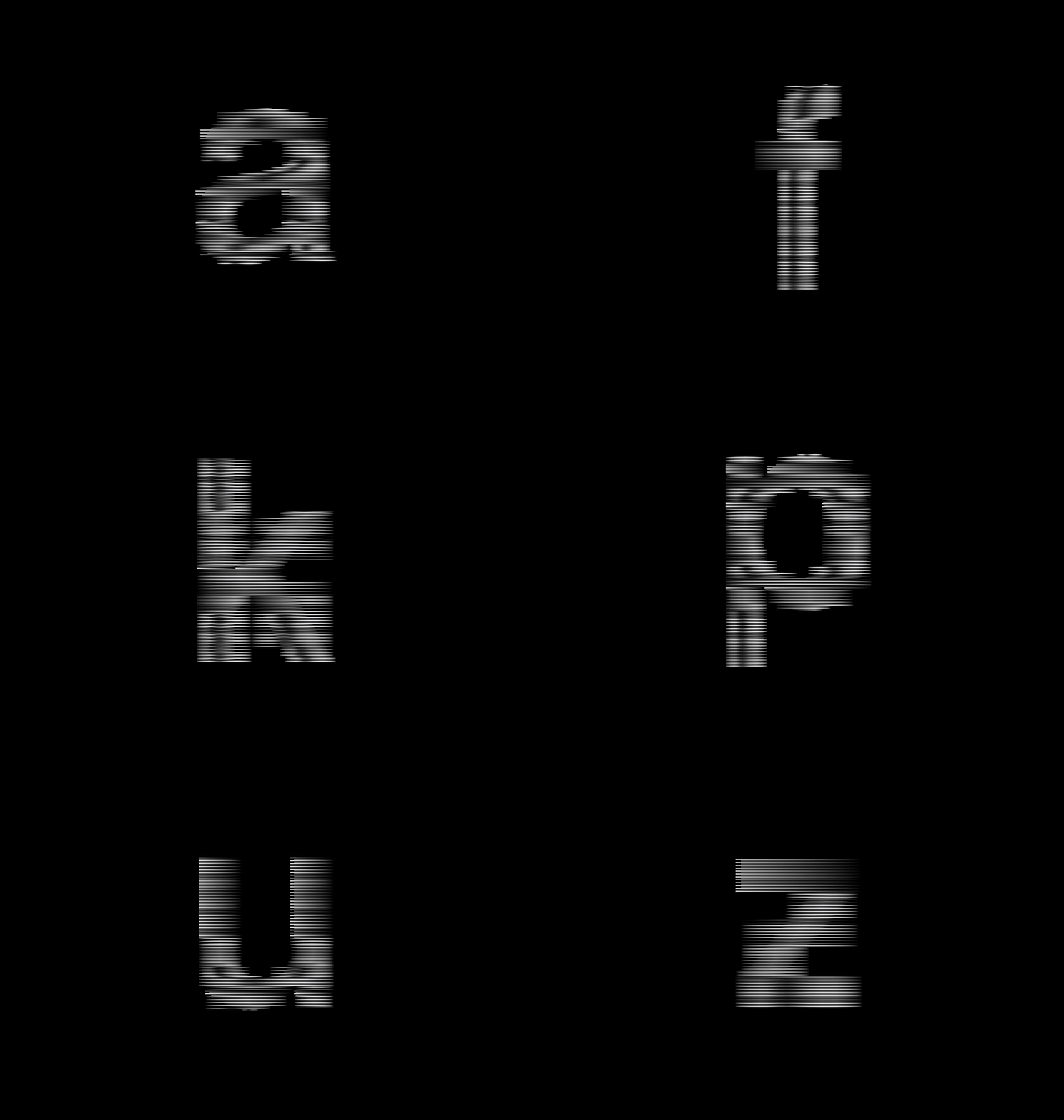
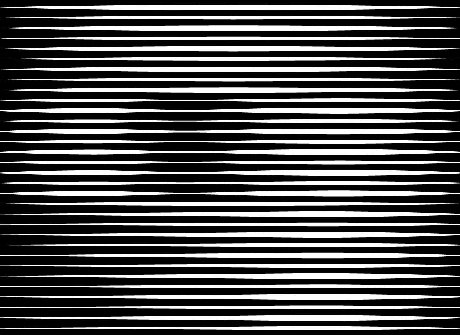
This is a font based on the moiré effect. To get the most out of this effect I applied a few rules for instance two different thicknesses of lines and use the anchor points in the letter to create longer lines.
